The Point Surf Stats
- Forecast
- Maps
- Live
- Weather State
- Spot Information
All swells
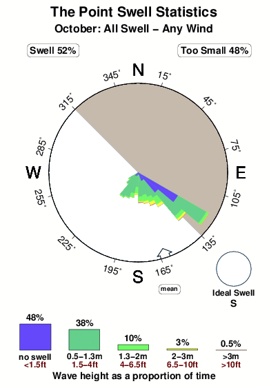


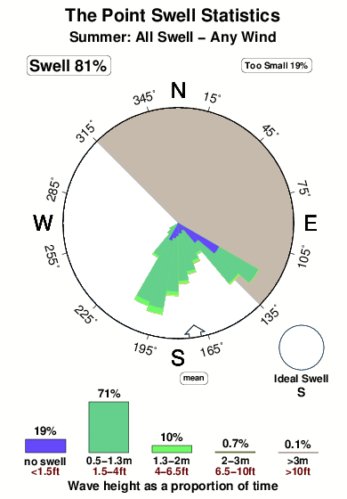
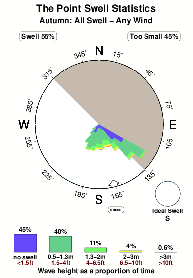
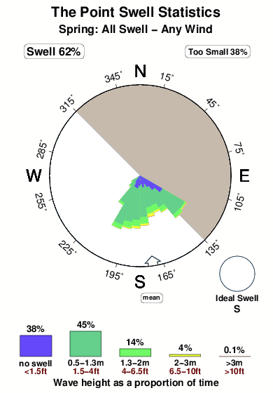
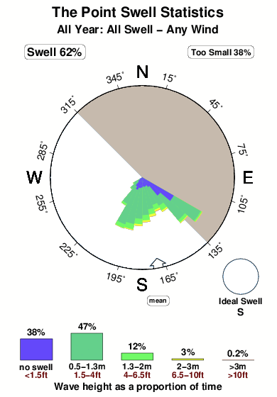
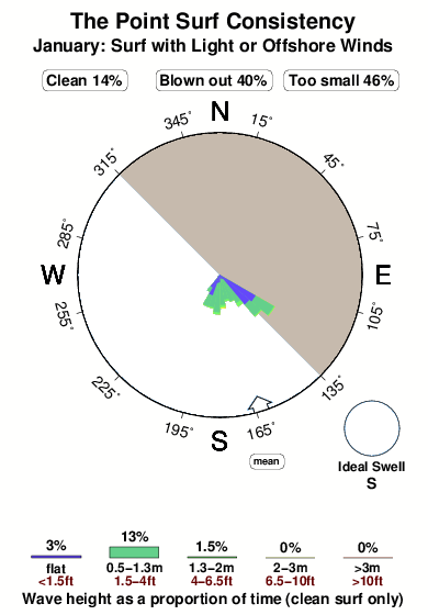
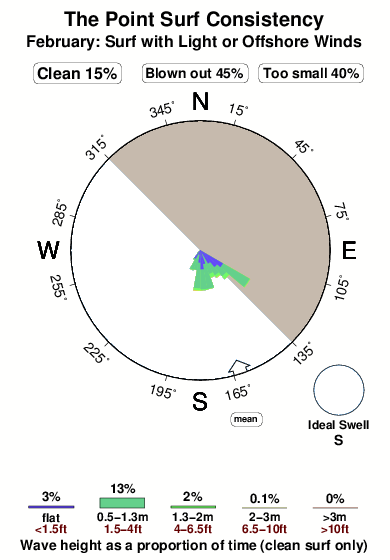
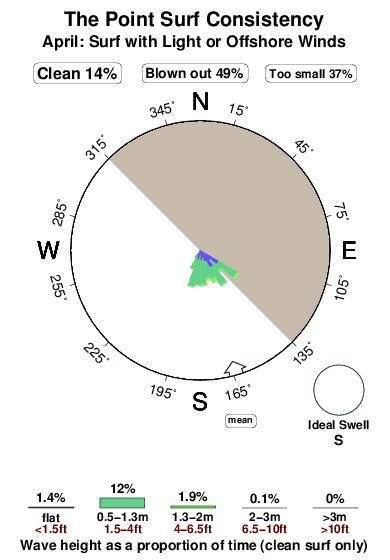
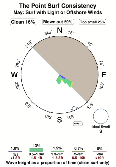
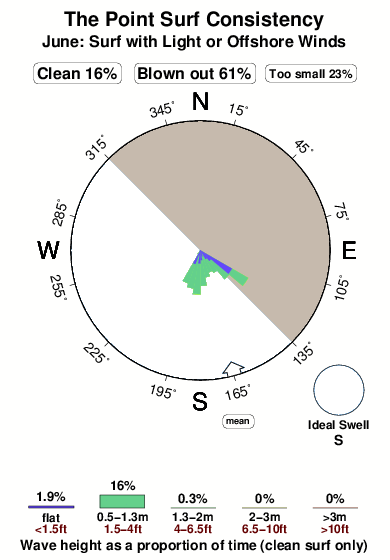
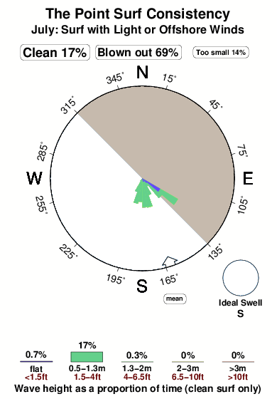
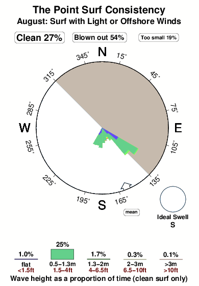
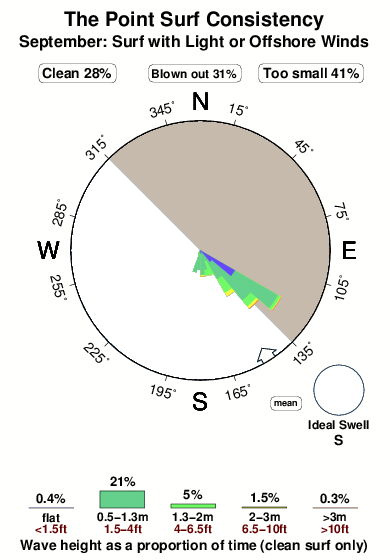
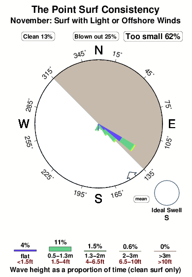
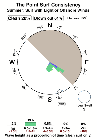
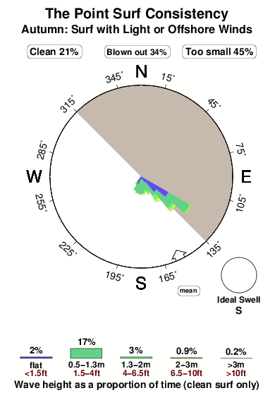
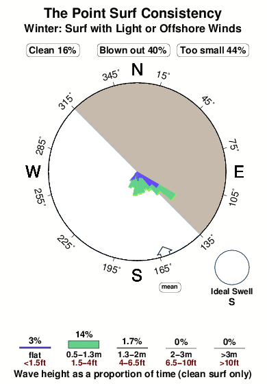
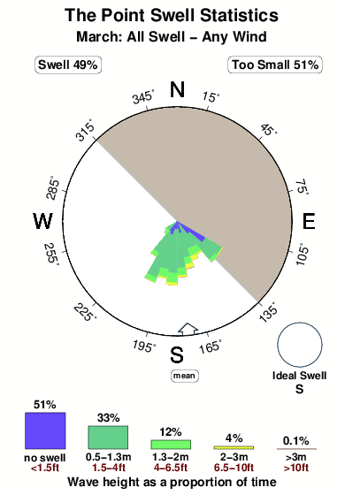
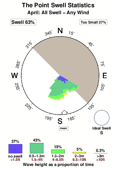
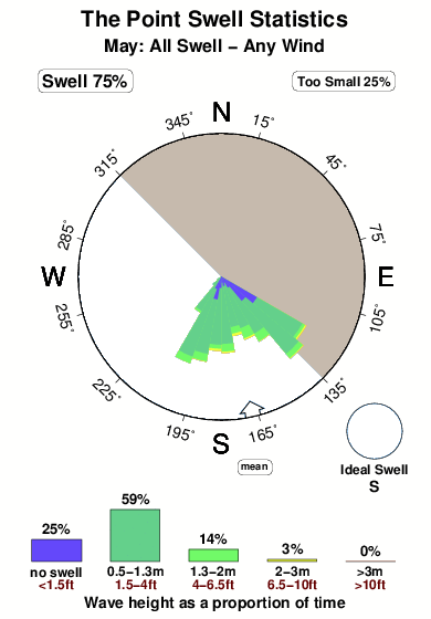
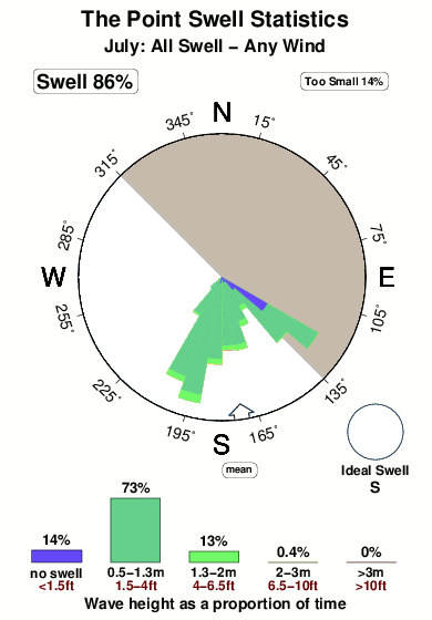
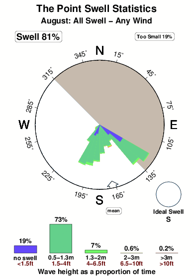
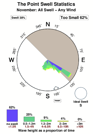
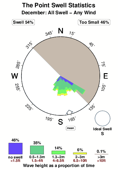
This picture illustrates the variation of swells directed at The Point through a typical October and is based upon 3471 NWW3 model predictions since 2006 (values every 3 hours). The wave model does not forecast surf and wind right at the shore so we have chosen the optimum grid node based on what we know about The Point. In this particular case the best grid node is 18 km away (11 miles). The rose diagram describes the distribution of swell sizes and directions, while the graph at the bottom shows the same thing but lacks direction information. Five colours represent increasing wave sizes. Very small swells of less than 0.5m (1.5 feet) high are shown in blue. These happened only 48% of the time. Green and yellow illustrate increasing swell sizes and red shows the largest swells, greater than >3m (>10ft). In each graph, the area of any colour is proportional to how often that size swell was forecast. The diagram indicates that the prevailing swell direction, shown by the largest spokes, was SSE, whereas the the most common wind blows from the N. Because the wave model grid is offshore, sometimes a strong offshore wind blows largest waves away from The Point and away from the coast. We group these with the no surf category of the bar chart. To keep it simple we don't show these in the rose graph. Because wind determines whether or not waves are good for surfing at The Point, you can select a similar diagram that shows only the swells that were predicted to coincide with glassy or offshore wind conditions. Over an average October, swells large enough to cause clean enough to surf waves at The Point run for about 52% of the time.


 Nearest